Think you’re unaffected? Think again.
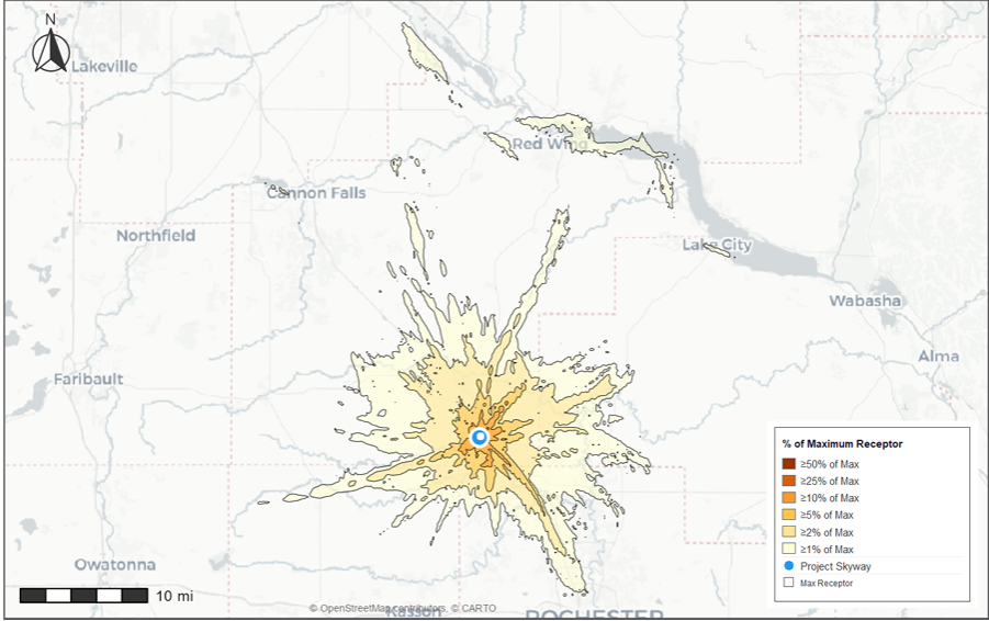
The Environmental Health Project completed an Air Pollution Dispersal Map for Project Skyway. This dispersal map used weather patterns from May 2023-April 2025 to create a model of where pollution from Project Skyway will likely be carried. The model is on a relative scale so it wouldn’t change if the scale of the facility changes. There might be minor tweaks if the epicenter were located in Phase 1, it is currently showing from the Phase 2 side of the project since the entire AUAR plot was considered. What will change is the colors and percentage of the pollution being dispersed as more specific details of the project are disclosed, such as the number of backup generators and total emissions with everything on the table. The greater the emissions the greater the amount of the pollution being carried. The map does not show the specific types of pollutants, the specific amounts in any given area or secondary pollution formed when pollutants combine to form new ones. An interactive map is here along with instructions (when you click the interactive map it goes to downloads, double click it from there and it will open in your browser).
Project Skyway is just one facility and the dispersal map provides a visual of just how far reaching the impacts of a single project can be. There are 5 hyperscale data center projects either in Goodhue county or within a 15 mile radius of Goodhue County: Farmington, Cannon Falls, Rosemount, Faribault and Pine Island. Each one would likely end up with a pollution dispersal map similar to Project Skyway, leading to a much greater cumulative impact if all 5 dispersal maps are placed on the same map to see the overlaps. Hyperscale projects are huge projects with huge emission numbers. Even smaller percentages of pollution are not so small when the starting point is massive. Transparency matters as well. If communities are to make informed decisions that have regional impacts everything needs to be on the table, full disclosure.
